

Design tips + hacks to customize your Notion workspace
One of the best things about Notion is the ability to customize it to meet your design aesthetic.
Something I’ve learned about myself and most people is if you don’t like the way software looks and feels you won’t use it. UX (user experience) is incredibly important when it comes to creating spaces that are not only inviting, but make content accessible.
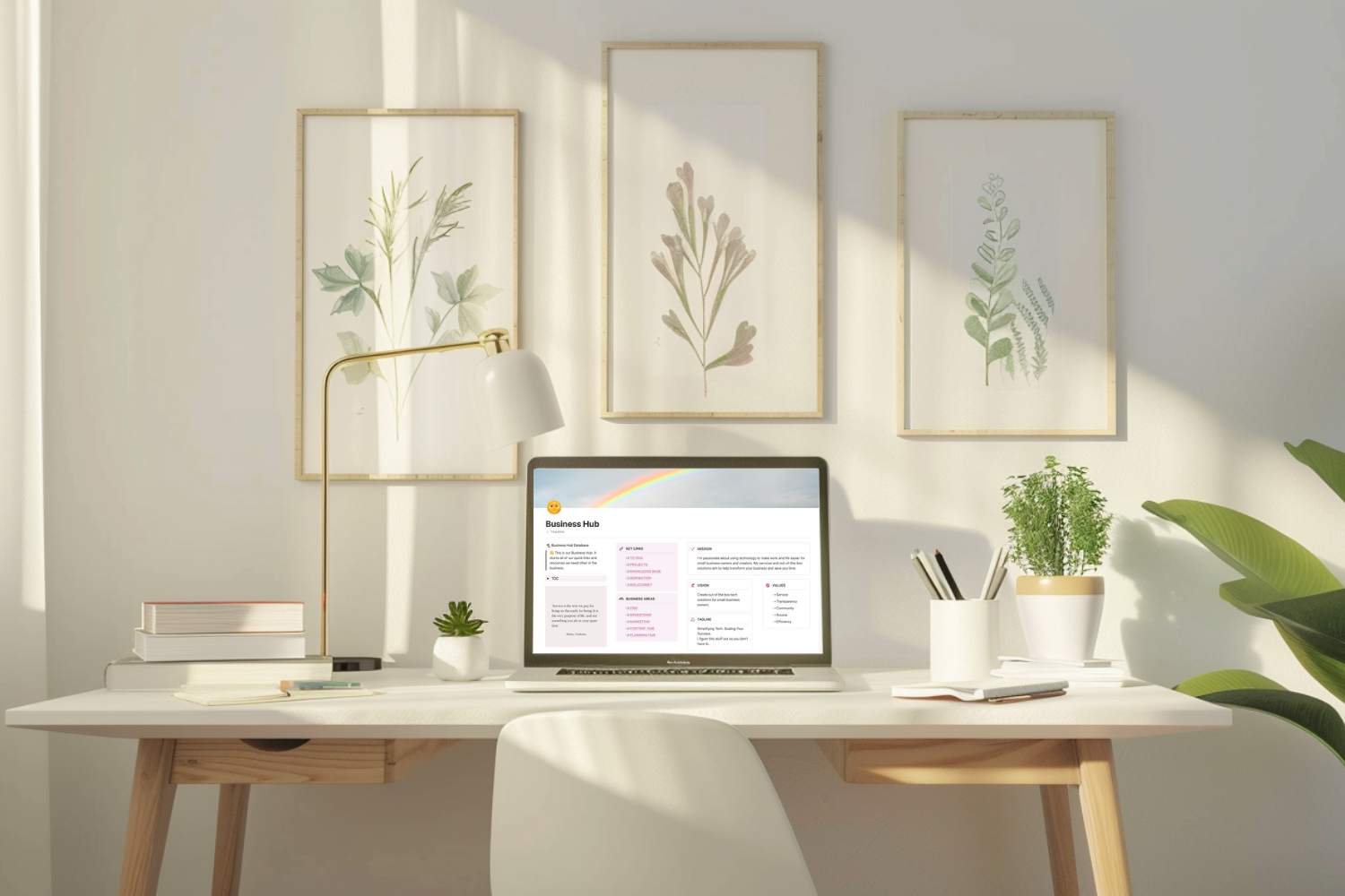
Design in Notion comes up a lot in my Notion consulting calls. Because Notion is so customizable, it can be overwhelming for people to decide what to add. And before you know it, very easy to overcrowd a page with too much content.
I’ve helped clients leverage Notion’s features as design elements so their workspace and content looks inviting and easy to navigate. Now I’m going to show you some of these tips and hacks for you to apply to your Notion workspace! I’ve got 5 different videos with tips to help you bling out your pages in Notion. If videos aren’t your thing, below the videos, I give you everything you need to know.
The below tips and hacks will not only make creating pages in Notion fun, but they’ll help create an enjoyable experience for you, your team, and your clients.
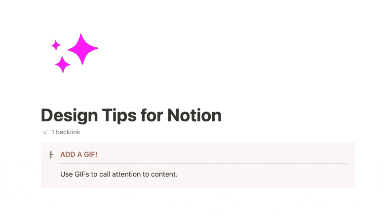
Add animated GIFs for icons in Notion
GIFs as custom icons for Notion Pages + Callouts
Notion gives three different options for different types of icons for its Workspaces, Pages, Databases, and Callouts; emojis, Notion’s own icons, or custom uploads.
Notion introduced their own icons in spring of 2023. These are great for uniformity and are fun to use with Callouts and Database properties, but can be a bit stiff if you want to add some flair.
Using your own icons can add a brand touch that makes a lot of difference AND you can even go so far as to add GIFs as icons!
In the video below, I walk you through how to create your own GIFs using Canva and 3D GIF Maker.
TL;DR
Creating GIF icons are extremely satisfying because it takes literal minutes to create them.
Login to Canva.
Create an image that’s 1500 x 1500px.
Search for graphic shapes that you’re able to add color to.
Adjust the graphic so it is centered and fills up most of the box; be sure to leave room on all sides.
Download the image with a transparent background.
Open up 3D GIF Maker.
Upload your image and adjust the size so it’s larger than the default box to avoid your new GIF icon being too small. (3D GIF Maker is very buggy, so be warned!)
Choose an animation. A few of my favs are 360° spin, thick 360° spin, fidget spinner, clockwise spin, and spiral and vanish.
Open your Notion page click on the icon, open Custom, upload your new GIF!
Customize fonts with KaTeX - adding highlights and more
Formatting Notion text with KaTeX code
As fun as Notion can be, it leaves a bit to be desired with its design elements. Their highlight options are a bit washed out, depending on what color you’re using and what mode you’re in (light or dark).
I wanted to see if I could highlight or color text in Notion, and I discovered I could easily do it with the Create Equation feature.
Then I decided to search around the web, to see what else I could get up to. I found this excellent post Advanced Notion Formatting Using KaTeX Expressions from Notion Things that dives deep into using KaTex for formatting.
There’s a lot of super helpful info in that post, in the below video I share how to highlight as well as a few new tips I learned from Notion Things.
Code and resources
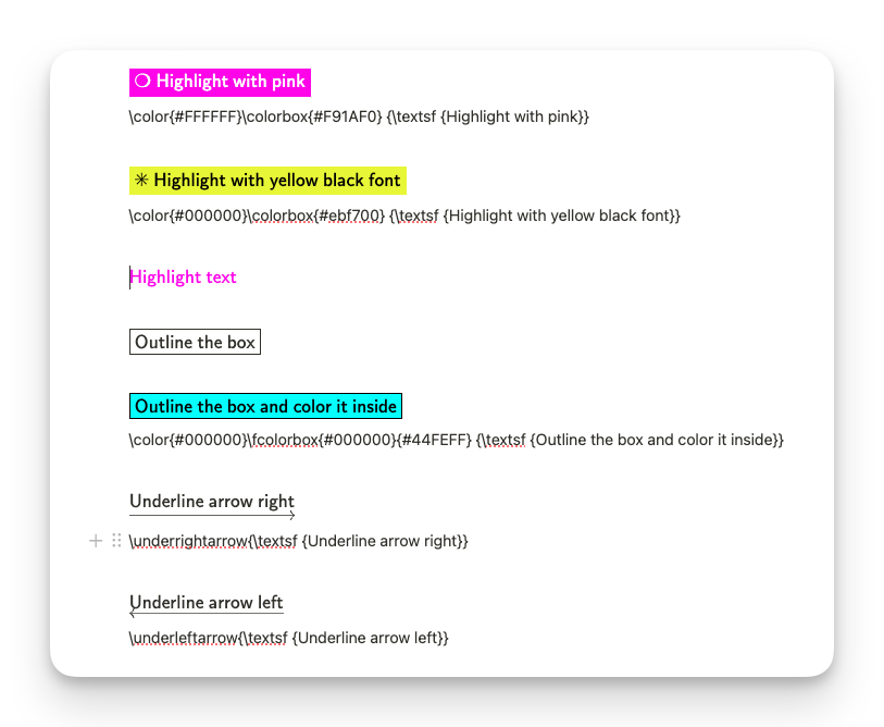
Use the below code to add to the Create equation in Notion to snazz up headers, paragraphs, and Callouts.
Highlighting

How to add KaTeX code with Create equation in Notion.
Highlight with florescent pink and white font: \color{#FFFFFF}\colorbox{#F91AF0} {\textsf {Add your text here}}
Highlight with florescent yellow and black font: \color{#000000}\colorbox{#ebf700} {\textsf {Add your text here}}
Add your own colors by replacing the hex code in the “color” space; replacing the hex code in the “colorbox” space;.
Box outline, box outline with highlight, and right arrow
Box outline: \fbox {\textsf {Add your text here}}
Box outline with highlight: \color{#000000}\fcolorbox{#000000}{#44FEFF} {\textsf {Add your text here}}
Right arrow: \underrightarrow{\textsf {Add your text here}}
Punch it up with a bit more flare!
KaTex support doc with lots of things to try!
Advanced Notion Formatting Using KaTeX Expressions from Notion Things.
Using KaTeX with Callouts
Now that we’ve played around with KaTeX a bit, we’re going to use it to fancy up Callouts. Callouts by far are one of the more fun features in Notion because there’s so much you can do with them. In this video, I share some KaTeX code and other design tips, as well as how to use it with the Toggle feature too!
Code for Callouts

Examples of Callouts using KaTeX
Callout with arrow: \underrightarrow{\textsf {Add your text here}}
Callout with pink highlight: \color{#F91AF0}{\textsf {Add your text here}}
Toggle with instructions: \color{#000}\colorbox{#ebf700} {\textsf {✖ Add your text here ✖}}
Other tips:
Spice up your callouts with dividers and numbered lists
Italicize and color font gray for another design element
More ways to use Callouts
Callouts have to be one of the most delightful features in Notion. They’re fun to make, offer a variety of customizations, and help break up your pages.
I use Callouts a lot in client builds and my own workspace. I use them for instructions, announcements, page intros, note boxes, and more. The options are pretty endless, especially when you start to embed Databases - that’s a whole other blog post!
TL;DR

Callouts to design and use in your content.
Here’s a little cheatsheet for the next time you want to mix up your callout design.
Use Callouts to…
Prompt viewers to buy your products. Link to templates, offers, book a one on one call, and more.
Offer directions on how to use the lead magnet. Use a call out with a toggle.
Create goal and/or notes areas with columns and checklists.
Create announcements for your team. Use bullets or toggles with dividers.
Direct viewers to follow you on social media, read your blog, download a freebie. Link to these!
Spruce them up with KaTex, GIF icons, toggles, columns, colors, bold and capitalize text…honestly the options are endless!
Things to remember
It is so easy to go bananas with design elements, but remember less is more, and white space is key. You want people to WANT to engage with your content not be so overwhelmed that they’re repelled.
There’s a few things to remember as you design content you want people to use:
Use white space as design elements.
Create a branded experience. Use the same colors and icons throughout the page so it’s visually cohesive.
Be sure to check your design on mobile to ensure it flows. Especially if you are using a lot of columns
If you’re part of a team, ask for feedback so you can iterate the design and content.
Ask people what works, where they get confused, and what would help them.
Pay attention to how people react to your content. Are they lost or overwhelmed?
Use design elements to support not crowd.
Notion is incredibly fun to build in, but it can also be one of it’s downfalls. It’s easy to get trapped building and creating. Remember the goal is to work IN Notion not ON it.
Good luck and have fun!